Self-Crit: On Biases Behind Forms
I began working on Crit to supply my own personal demand for a grotesque sans family, which serves as a hybrid of Akzidenz Grotesk and Helvetica. The design specifically draws on the weird and coincidental misuse of both typefaces in display contexts like posters and catalogs, particularly from the phototypesetting era.
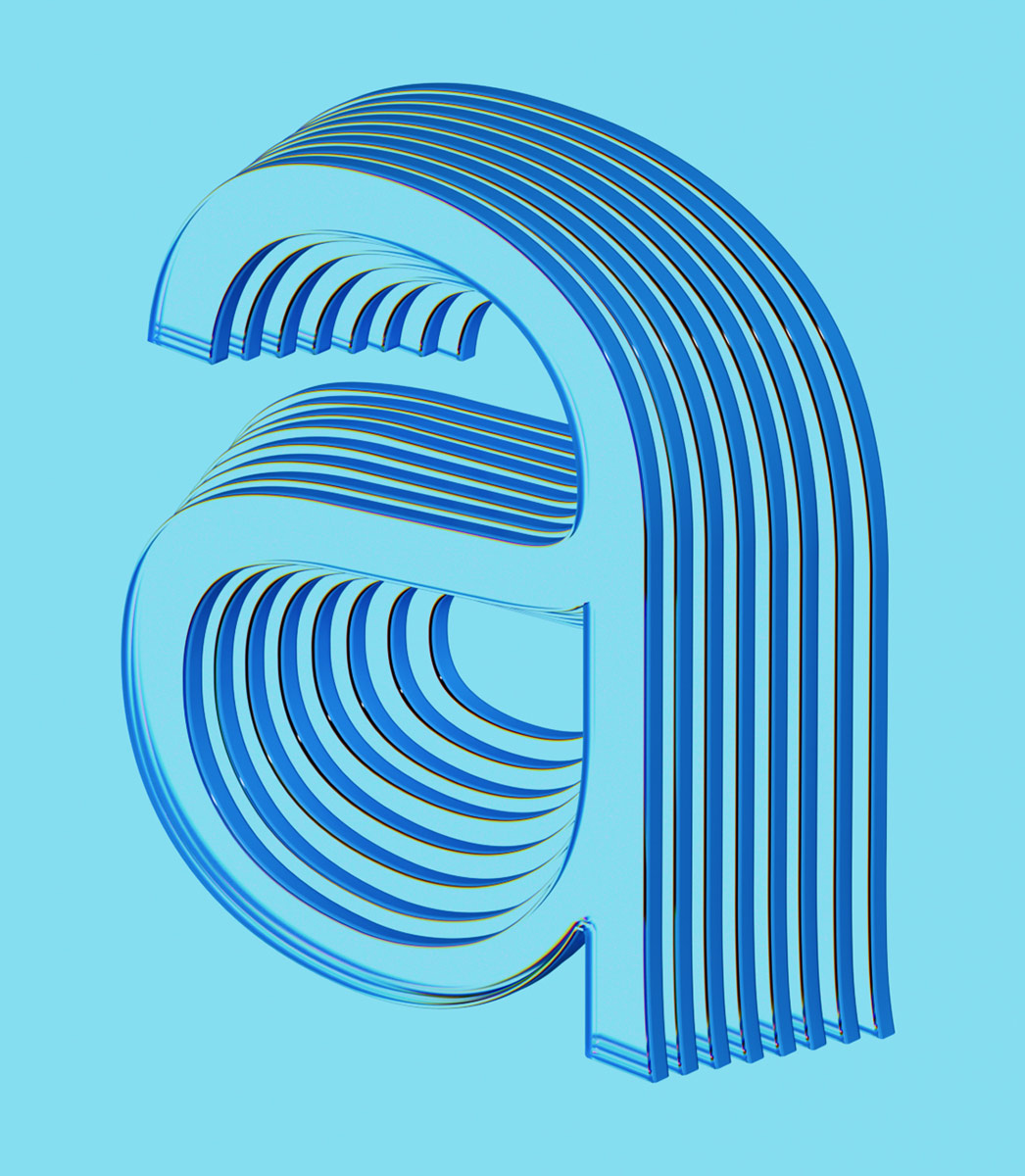
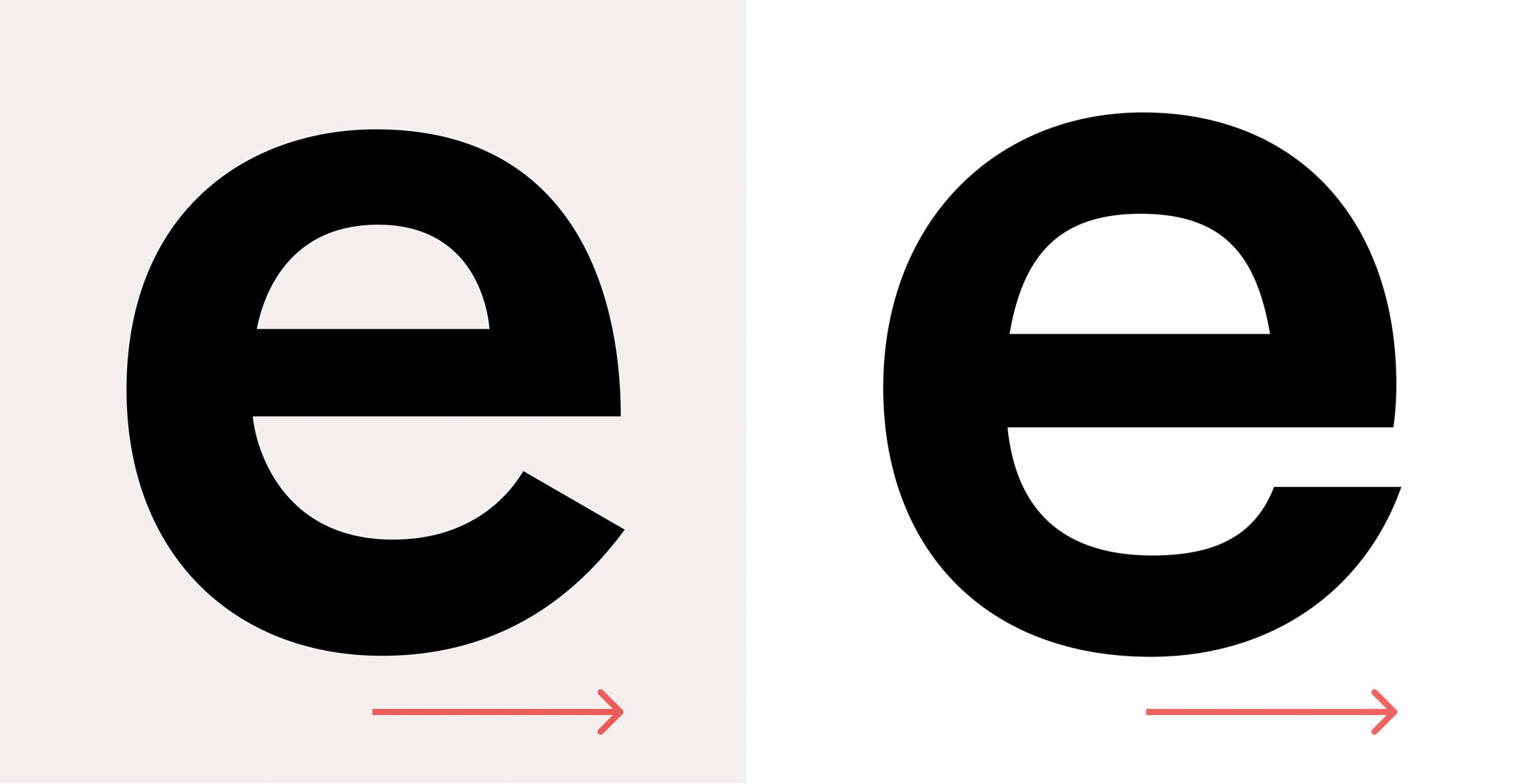
Since childhood, my favorite letterform has been the lowercase “e” of Akzidenz Grotesk Halbfett, a shape that stood out to me the moment I first started noticing the subtle differences of letterforms in my school textbooks. Picking Akzidenz as the main inspiration for this typeface was an obvious choice. But also historical sources like Breite Halbfette Grotesk by J.G. Schelter & Giesecke (circa 1890) and Grotesque No. 1 by Miller & Richard (circa 1912) were carefully considered while making critical decisions.
Crit is initiated as another workhorse sans, while closely tied to Akzidenz Grotesk, I wanted Crit to look as different from it as possible. The heritage aspect of being a true grotesque should be instantly recognizable but every detail of the letters must be different or somewhat unique. To achieve this, counter spaces are more squarish than the outline (similar to Grotesque No. 1) and optical corrections are done with inktraps pushing outward to the stems. Terminals have straight corners at one side and flare-like turns on the other. Descenders and ascenders are really short, almost squeezed to the vertical space, creating a very tight and solid appearance. But the rest is following the grotesque archetype.

Lowercase e from Akzidenz Grotesk Halbfett
As I went through the posters and ephemera made in the golden era of International Swiss Style, a particular example caught my eye. Opernhaus Zürich posters by Josef Müller-Brockmann used a headline typeface with letters featuring both open and closed terminals, and occasional deformations. Like a cross match of Akzidenz Grotesk and Helvetica which were both heavily popular at the time. Keeping some of the “spirit” from the early grotesques but neutrality and utility of Helvetica sounded like a perfect starting point. That created the formula of following proportions of contemporary neo-grotesques while practicing freedom of expression in small details.
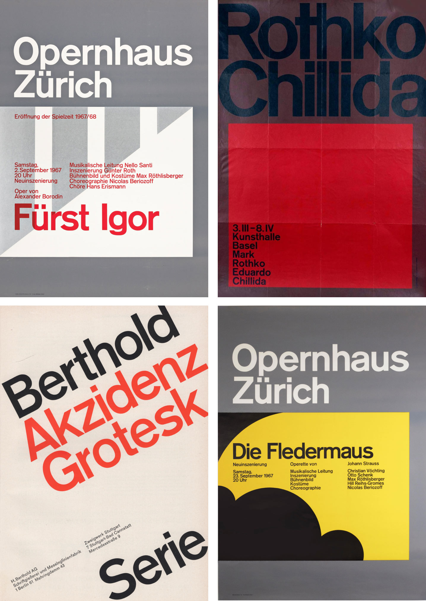
Main inspiration, grotesques in use as display faces from International Swiss Style
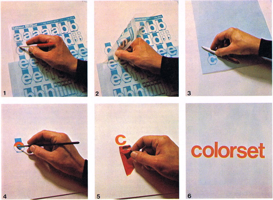
A set of photos showing the process of dry transfer applications such as Letraset, Chartpack, Meccanorma. Creating graphic compositions and lettering by hand was part of the daily routine of the designers. It allows using ready made fonts but also making modifications on them by hand.
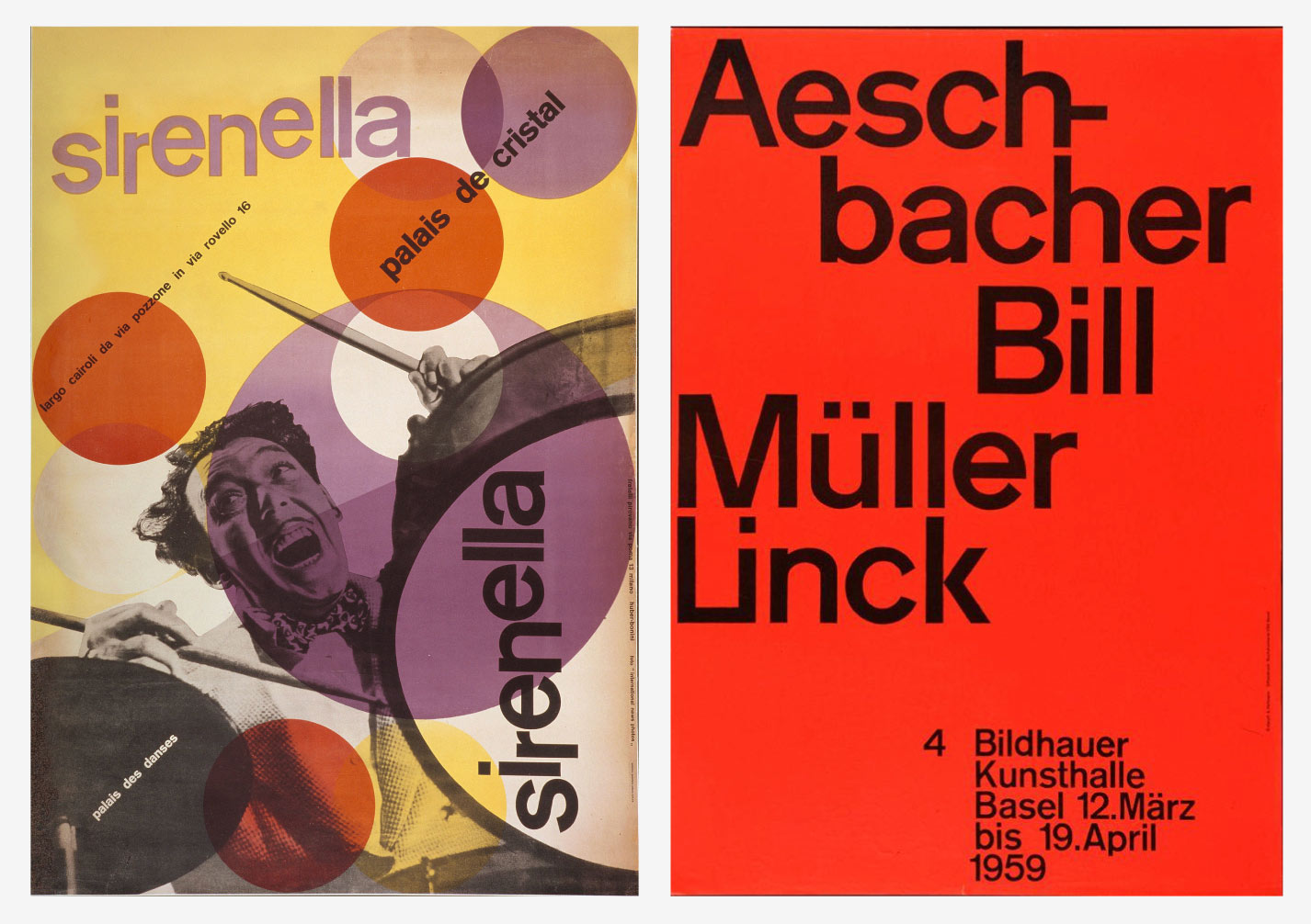
Posters like Sirenella by Max Huber and 4 Bildhauer by Armin Hoffman have similar deformations -probably caused by copying letterforms by hand- which creates a unique appearance for every letter. It is possible to sense a broader “style” on drawing letters rather than using the same “face” while looking at all those examples. Almost like vernacular typography, but following the same lettering style more closely than any other historical instance.
In these posters, early modernist sans serifs were in the spotlight, playing the critical role of catching the eye. And to successfully play that role, letterforms were perfected by hand whenever necessary. Text faces drawn for legibility at long passages were repositioning themselves as the centerpiece by using their balanced and neutral forms in the era of modernism. That careful intervention at the critical moments and customization practice that makes or breaks a perfect look gave the initial kick-off to Crit. As I continued to dissect the letterforms from my poster references I started to see that the little differences are caused by multiple reasons.
1. They are copied by hand, altered deliberately or by mistake.
2. The different point sizes of the same font have inconsistencies.
3. You could use a letter from another font if you don’t have the complete set of letters and if it looks close enough.
The coincidental assortment of shapes gave me the idea of making truly my own personal version by selecting my favourite forms from different typefaces and point sizes. I set out to create a sans-serif with a cold, straight face with some historical references initially, but flexing the boundaries sounded much more interesting and fun!
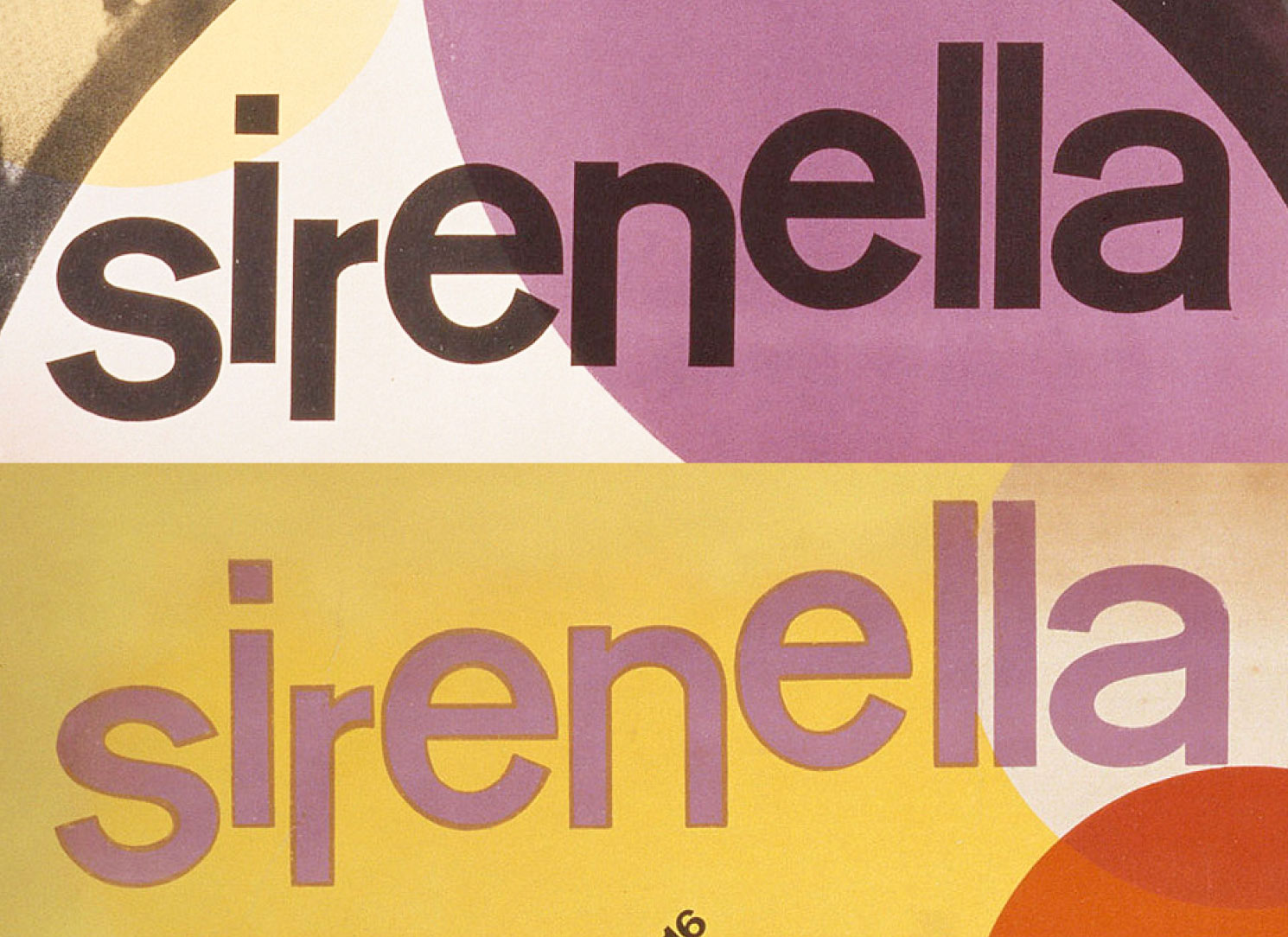
The word “Sirenella” is made with the same letters that look different from each other. The bottom one appears to be drawn by hand, which is curious to find in the same poster.
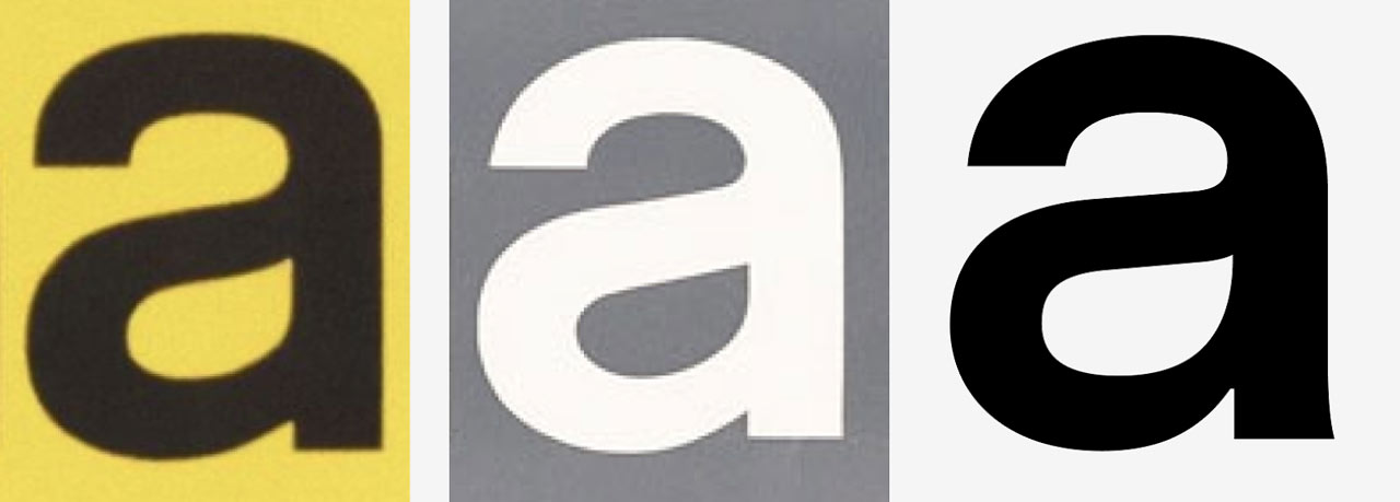
Left and middle, multiple “a” forms from the poster Opernhaus Zürich, Die Fledermaus - Right, Crit Semibold
I started with drawing the Semibold master (which was planned as the Medium at that time) as it is the most used weight of the grotesque typefaces in early modernist graphic design. The rest of the weights could follow the lead of the Semibold when it successfully reflects the essence of an early grotesque. The goal was to draw letters which look good for big sizes such as headlines, posters and logos. But these letterforms should also perform well in running text and for longer reading. I began with drawing the lowercase which has an extra tall x-height, and after added the uppercase. I designed the ascenders to minimally exceed the top of the x-height, the descenders are similarly short. Whitespace between the lines is reduced with the clamped lengths of letter extensions and it helps to create a tightly packed appearance. This was the first critical decision that set the characteristics of the family.
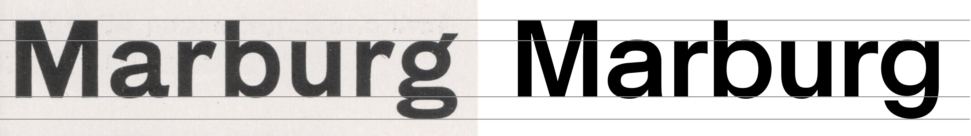
Left, Blockschrift 24 pt. by Genzsch & Heyse - Right, Crit Semibold
Crit appears bigger and darker with less whitespace thanks to its smaller extension dimensions and taller x-height.
Another distinctive characteristic is made by pushing the boundaries of horizontal proportions of the grotesque genre. The round uppercase letters like O, C and G and their lowercase counterparts are wider than most of the type families in the same category. Words set in Crit fills the space without hesitation, they look confident as is expected from display type. But it also stays in the limits of a workhorse sans-serif without sacrificing its utilitarian roots.
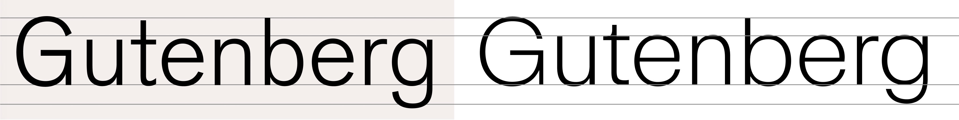
Left, Berthold Akzidenz Grotesk Light - Right, Crit Extralight
Crit can perform well in bigger usage even with lighter weights.
Crit tries to keep a balance between standardization and dynamism when it comes to proportions. The letters are not forced to look as equally wide like Helvetica. But the width differences are not excessively varied like Futura. Crit sits somewhere between the two. It makes it ideal for branding and design systems where you need consistency in general but also impactful displays occasionally.
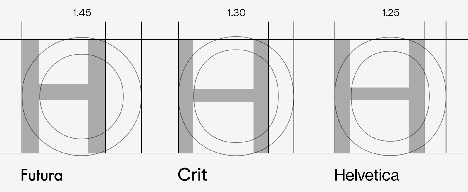
Different width ratios of H and O
During the design process, I drew firm boundaries for myself in an effort to trigger creativity. One of these constraints was to stick closely to the historical references, while finding new ways to rework them. Luckily, there are millions of tiny differences you can make while designing a typeface. Some technical qualities are often invisible if not closely examined, yet their cumulative effect is what we call “character”. I looked for ways to put them in use by exaggerating, deforming and mixing. Make it monolinear, but add some contrast. Closed aperture with widened forms. Add unexpected flares whenever you feel like it. It starts to feel like weaving a spider web, invisible strands getting tied together hundreds of times for a visible structure.
My beloved Akzidenz Medium “e” has a lower terminal pushing outwards the overall shape, it is expected from an angled terminal. Crit has the same behavior for its closed terminals as a personal touch. That sort of deformations which can be interpreted as technical or artistic choices are what my inner voice calls “critical decisions”.
Subtle touches, lower terminal pushing outwards.
Grotesque No.1, 42 pt. by Miller & Richard featuring squarish counter shapes
In another attempt to add a personal touch to the look and feel of the family, I found inspiration in Grotesque No.1, 42 pt. by Miller & Richard with its high contrast stroke modulation. That was coming from the counters being squarer than its outer shape. I used the same idea while drawing the Black master in order to avoid letters appearing too soft. It allowed me to keep the outer shapes consistent with the other masters while making the bolder weights appear stronger and edgier.
But I wasn’t aiming for a squarish font whatsoever, this wasn’t an attempt to get closer to Eurostile or other engineered styles. It was just another ingredient in my personal neo-grotesque recipe. Lighter weights looked too far away from my intentions so their negative spaces ended up being less squarish. But bolder weights, especially the Black look sturdier and have their own character with the square touch.
Another technical requirement for a text typeface like this is inktraps. Crit’s inktraps were intended to be a tool for display sizes at first, I wanted to break the mold of a text face as the font size increases. The inktraps are positioned outside of the stems instead of getting some portion of them with minor exceptions. I extracted interesting and memorable shapes and there was no cost for legibility while doing that. The inktraps are still invisible enough for small text sizes, and pleasing to look at for those “hero” moments.
Crit’s counter shapes get squarer as the weight increases.
Inktraps pushing out of stems instead of carving them. A unique look in big point sizes and still works for optical corrections.
After a major part of the typeface had been drawn, I started testing it with all kinds of text. Not just classic testing strings like pangrams and spacing pairs but also lots of copy from magazines and digital ads from different languages. I realized rf and rt pairs look like they are blending into a single shape. You can feel like that for a lot of pairs sometimes, and mostly you don’t have to do anything to make them look correct. Letters look legible standing by themselves and just fine after thousands of years of man made evolution (right?). But no, it was like they were forcing me to glue them together so I could get a good night’s sleep. I resisted the urge at first, because this typeface is about utility and should include only necessities. But in fact, the flat top of r and horizontal bars of f and t were touching almost perfectly with kerning. And that was creating a better text flow when avoiding a tiny gap between two letters. I stopped resisting and started working on these new ligatures.
I also planned to expand the ligature set with ct, st, sf and all kinds of “fun” pairs but none of them were quite useful for reading like rf and rt. I decided to keep the ligature set minimal, you only get to stay if you contribute to legibility or text flow.
Months later, I stumbled upon a magazine ad from Berthold Fototype featuring some strong kerning for rt and tt pairs. I imagine the designer of the ad wished they had those ligatures ready in hand so they could avoid the weird bulging between r and t. I see this as a proof of the need for new and innovative ligatures.

The classic ff and my unorthodox rf and rt ligatures side by side
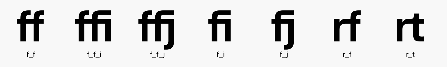
Final ligature set of Crit.
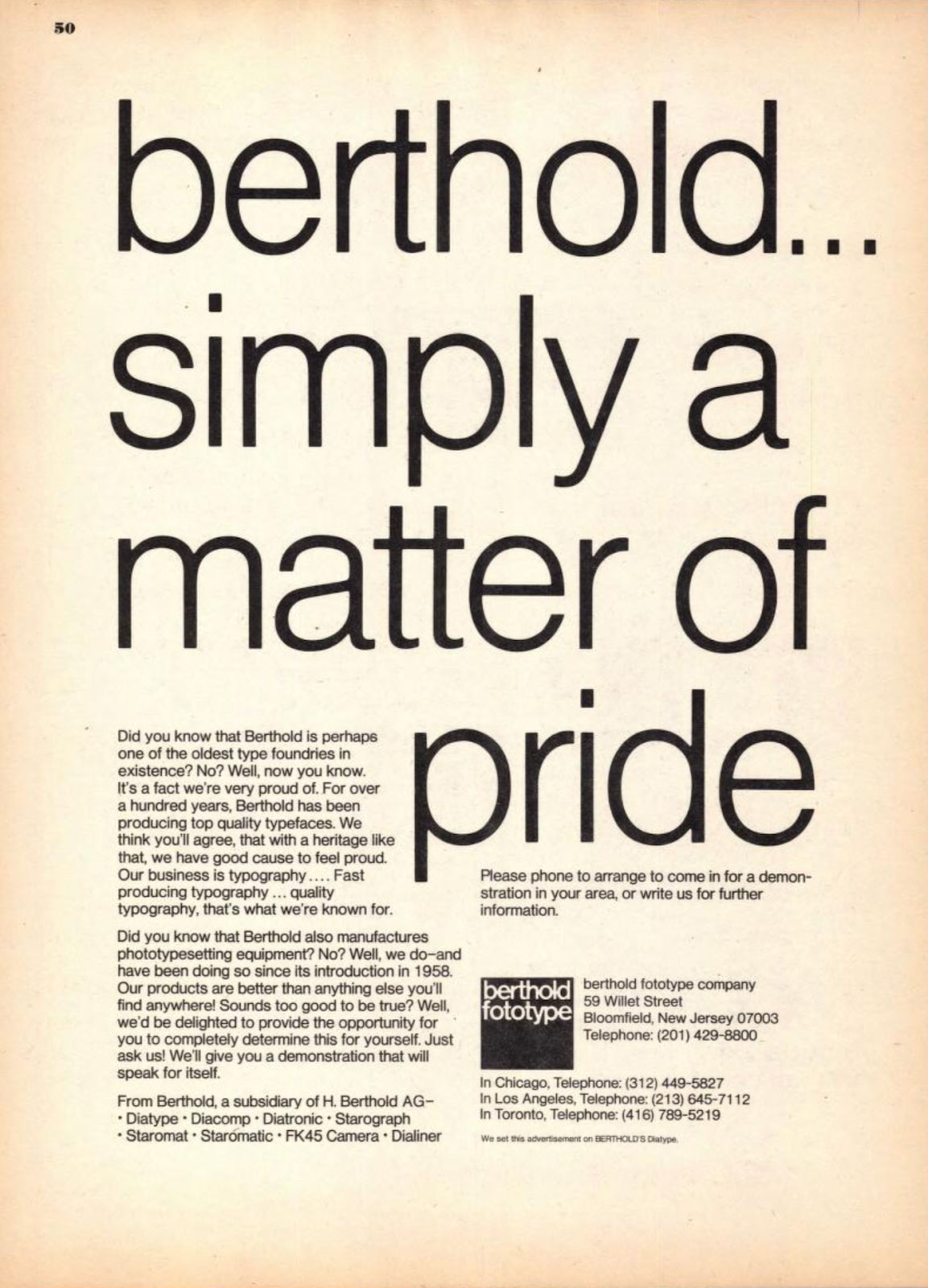
Berthold Fototype US magazine ad
In my own experience working on brand systems or big editorial projects, simplifying typography choices creates a more consistent visual language. But it comes with another challenge. To keep up with numerous font families, font files, text or display cuts and optical sizes. The variable font technology can be a solution for this but I also wanted to design Crit in a way that can work as a one-fits-all asset. One that only relies on its nature to perform the same task without complicating things. The same cut being used for multiple scales on a layout, interface or video. Tall x-height, letterforms that go well on big headlines, spacing that allows comfortable reading. And another trick I love is being able to have negative tracking without having to kern some letters by hand, nothing is touching unless intended. It is imperative for me to use my fonts to design promotion materials (or just something for fun) as I’m still working on them. Most of my ideas get sharper day by day while doing that. I remember trying to pick the best workhorse type while creating identities for art institutions and galleries. The design team say things like “It should be firm, but smooth”, “witty and fun and no-nonsense”. It should connect with that exhibition, artist or particular event. Getting some hints from the conceptualization of an art piece, a background story of an artist, then finding the visual equivalent is an enjoyable task. I go back to the same process while working on fonts. And it is very easy to do the same for a sans serif. Lots of history, cultural evolution and art for reference. I started imagining Crit being used for a cultural institution because it would be a challenging reference point. It would look great in most places if it can perform well for a genre that puts textual content on top of everything else. Don’t compete with the images, help me understand them. Don’t look boring, make those titles catch my eye.
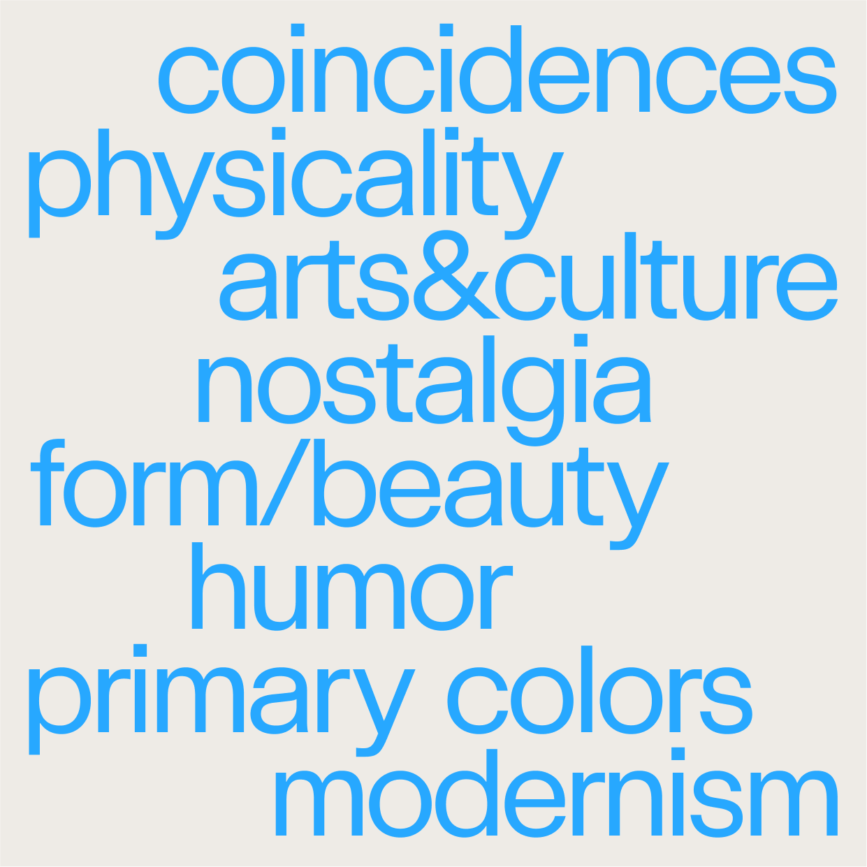
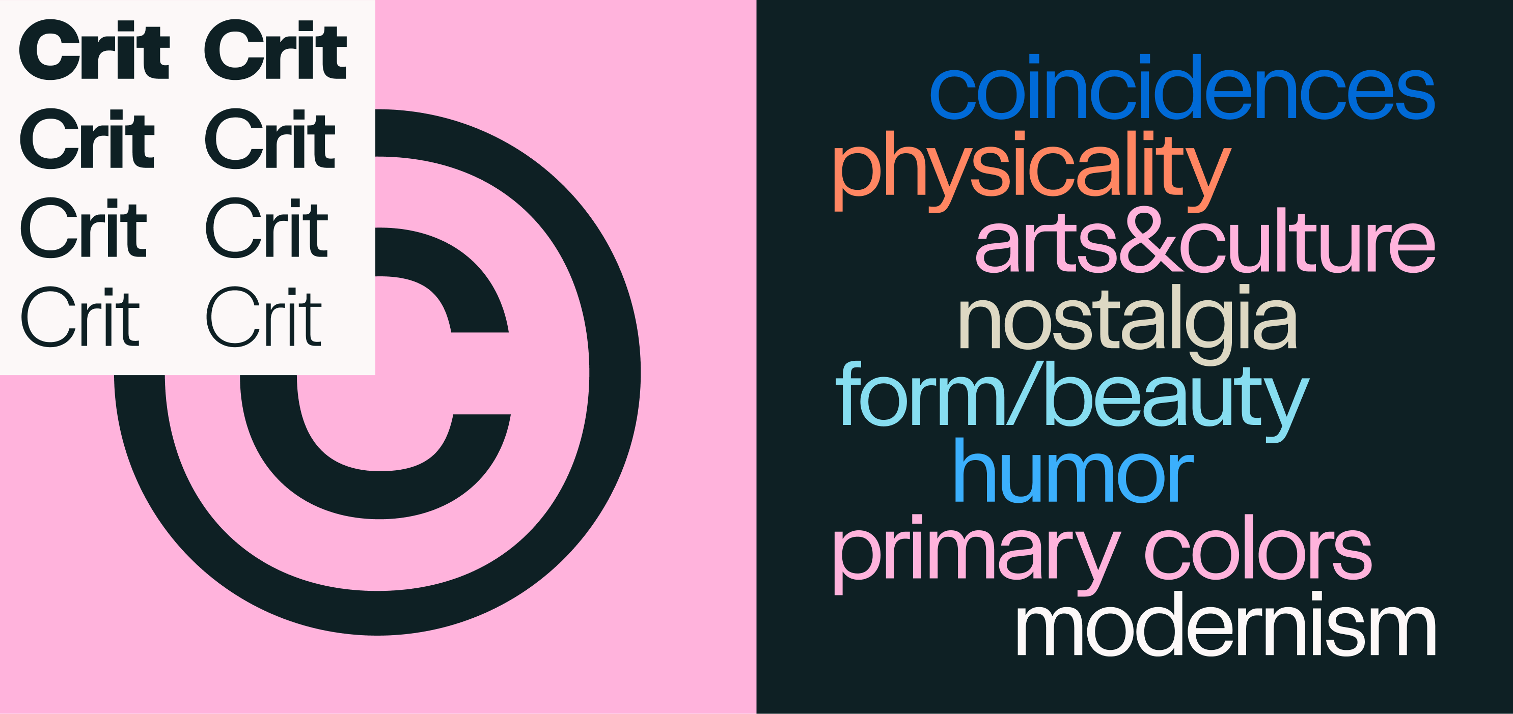
I use some words borrowed from the artistic lingo like “coincidentalness”, “physicality”, “nostalgia” and a couple more while I’m trying to express the feeling behind Crit. A bit obscure and not so clear maybe. And also the name itself is a play between “critical thinking” of a creative mind and “critical attack” from video games. That fluidity feels personal, unforced and artistic in a way when trying to express the spirit of the typeface. A sans serif that tries to stretch the boundaries of its genre and expresses its nature. I feel like I pushed some imaginary buttons at the right time and my imaginary punches landed at the right spot, a critical hit.
Self-Crit: On Biases Behind Forms
I began working on Crit to supply my own personal demand for a grotesque sans family, which serves as a hybrid of Akzidenz Grotesk and Helvetica. The design specifically draws on the weird and coincidental misuse of both typefaces in display contexts like posters and catalogs, particularly from the phototypesetting era.
Since childhood, my favorite letterform has been the lowercase “e” of Akzidenz Grotesk Halbfett, a shape that stood out to me the moment I first started noticing the subtle differences of letterforms in my school textbooks. Picking Akzidenz as the main inspiration for this typeface was an obvious choice. But also historical sources like Breite Halbfette Grotesk by J.G. Schelter & Giesecke (circa 1890) and Grotesque No. 1 by Miller & Richard (circa 1912) were carefully considered while making critical decisions.
Crit is initiated as another workhorse sans, while closely tied to Akzidenz Grotesk, I wanted Crit to look as different from it as possible. The heritage aspect of being a true grotesque should be instantly recognizable but every detail of the letters must be different or somewhat unique. To achieve this, counter spaces are more squarish than the outline (similar to Grotesque No. 1) and optical corrections are done with inktraps pushing outward to the stems. Terminals have straight corners at one side and flare-like turns on the other. Descenders and ascenders are really short, almost squeezed to the vertical space, creating a very tight and solid appearance. But the rest is following the grotesque archetype.
Lowercase e from Akzidenz Grotesk Halbfett
As I went through the posters and ephemera made in the golden era of International Swiss Style, a particular example caught my eye. Opernhaus Zürich posters by Josef Müller-Brockmann used a headline typeface with letters featuring both open and closed terminals, and occasional deformations. Like a cross match of Akzidenz Grotesk and Helvetica which were both heavily popular at the time. Keeping some of the “spirit” from the early grotesques but neutrality and utility of Helvetica sounded like a perfect starting point. That created the formula of following proportions of contemporary neo-grotesques while practicing freedom of expression in small details.
Main inspiration, grotesques in use as display faces from International Swiss Style
A set of photos showing the process of dry transfer applications such as Letraset, Chartpack, Meccanorma. Creating graphic compositions and lettering by hand was part of the daily routine of the designers. It allows using ready made fonts but also making modifications on them by hand.
Posters like Sirenella by Max Huber and 4 Bildhauer by Armin Hoffman have similar deformations -probably caused by copying letterforms by hand- which creates a unique appearance for every letter. It is possible to sense a broader “style” on drawing letters rather than using the same “face” while looking at all those examples. Almost like vernacular typography, but following the same lettering style more closely than any other historical instance.
In these posters, early modernist sans serifs were in the spotlight, playing the critical role of catching the eye. And to successfully play that role, letterforms were perfected by hand whenever necessary. Text faces drawn for legibility at long passages were repositioning themselves as the centerpiece by using their balanced and neutral forms in the era of modernism. That careful intervention at the critical moments and customization practice that makes or breaks a perfect look gave the initial kick-off to Crit. As I continued to dissect the letterforms from my poster references I started to see that the little differences are caused by multiple reasons.
1. They are copied by hand, altered deliberately or by mistake.
2. The different point sizes of the same font have inconsistencies.
3. You could use a letter from another font if you don’t have the complete set of letters and if it looks close enough.
The coincidental assortment of shapes gave me the idea of making truly my own personal version by selecting my favourite forms from different typefaces and point sizes. I set out to create a sans-serif with a cold, straight face with some historical references initially, but flexing the boundaries sounded much more interesting and fun!
The word “Sirenella” is made with the same letters that look different from each other. The bottom one appears to be drawn by hand, which is curious to find in the same poster.
Left and middle, multiple “a” forms from the poster Opernhaus Zürich, Die Fledermaus - Right, Crit Semibold
I started with drawing the Semibold master (which was planned as the Medium at that time) as it is the most used weight of the grotesque typefaces in early modernist graphic design. The rest of the weights could follow the lead of the Semibold when it successfully reflects the essence of an early grotesque. The goal was to draw letters which look good for big sizes such as headlines, posters and logos. But these letterforms should also perform well in running text and for longer reading. I began with drawing the lowercase which has an extra tall x-height, and after added the uppercase. I designed the ascenders to minimally exceed the top of the x-height, the descenders are similarly short. Whitespace between the lines is reduced with the clamped lengths of letter extensions and it helps to create a tightly packed appearance. This was the first critical decision that set the characteristics of the family.
Left, Blockschrift 24 pt. by Genzsch & Heyse - Right, Crit Semibold
Crit appears bigger and darker with less whitespace thanks to its smaller extension dimensions and taller x-height.
Another distinctive characteristic is made by pushing the boundaries of horizontal proportions of the grotesque genre. The round uppercase letters like O, C and G and their lowercase counterparts are wider than most of the type families in the same category. Words set in Crit fills the space without hesitation, they look confident as is expected from display type. But it also stays in the limits of a workhorse sans-serif without sacrificing its utilitarian roots.
Left, Berthold Akzidenz Grotesk Light - Right, Crit Extralight
Crit can perform well in bigger usage even with lighter weights.
Crit tries to keep a balance between standardization and dynamism when it comes to proportions. The letters are not forced to look as equally wide like Helvetica. But the width differences are not excessively varied like Futura. Crit sits somewhere between the two. It makes it ideal for branding and design systems where you need consistency in general but also impactful displays occasionally.
Different width ratios of H and O
During the design process, I drew firm boundaries for myself in an effort to trigger creativity. One of these constraints was to stick closely to the historical references, while finding new ways to rework them. Luckily, there are millions of tiny differences you can make while designing a typeface. Some technical qualities are often invisible if not closely examined, yet their cumulative effect is what we call “character”. I looked for ways to put them in use by exaggerating, deforming and mixing. Make it monolinear, but add some contrast. Closed aperture with widened forms. Add unexpected flares whenever you feel like it. It starts to feel like weaving a spider web, invisible strands getting tied together hundreds of times for a visible structure.
My beloved Akzidenz Medium “e” has a lower terminal pushing outwards the overall shape, it is expected from an angled terminal. Crit has the same behavior for its closed terminals as a personal touch. That sort of deformations which can be interpreted as technical or artistic choices are what my inner voice calls “critical decisions”.
Subtle touches, lower terminal pushing outwards.
Grotesque No.1, 42 pt. by Miller & Richard featuring squarish counter shapes
In another attempt to add a personal touch to the look and feel of the family, I found inspiration in Grotesque No.1, 42 pt. by Miller & Richard with its high contrast stroke modulation. That was coming from the counters being squarer than its outer shape. I used the same idea while drawing the Black master in order to avoid letters appearing too soft. It allowed me to keep the outer shapes consistent with the other masters while making the bolder weights appear stronger and edgier.
But I wasn’t aiming for a squarish font whatsoever, this wasn’t an attempt to get closer to Eurostile or other engineered styles. It was just another ingredient in my personal neo-grotesque recipe. Lighter weights looked too far away from my intentions so their negative spaces ended up being less squarish. But bolder weights, especially the Black look sturdier and have their own character with the square touch.
Another technical requirement for a text typeface like this is inktraps. Crit’s inktraps were intended to be a tool for display sizes at first, I wanted to break the mold of a text face as the font size increases. The inktraps are positioned outside of the stems instead of getting some portion of them with minor exceptions. I extracted interesting and memorable shapes and there was no cost for legibility while doing that. The inktraps are still invisible enough for small text sizes, and pleasing to look at for those “hero” moments.
Crit’s counter shapes get squarer as the weight increases.
Inktraps pushing out of stems instead of carving them. A unique look in big point sizes and still works for optical corrections.
After a major part of the typeface had been drawn, I started testing it with all kinds of text. Not just classic testing strings like pangrams and spacing pairs but also lots of copy from magazines and digital ads from different languages. I realized rf and rt pairs look like they are blending into a single shape. You can feel like that for a lot of pairs sometimes, and mostly you don’t have to do anything to make them look correct. Letters look legible standing by themselves and just fine after thousands of years of man made evolution (right?). But no, it was like they were forcing me to glue them together so I could get a good night’s sleep. I resisted the urge at first, because this typeface is about utility and should include only necessities. But in fact, the flat top of r and horizontal bars of f and t were touching almost perfectly with kerning. And that was creating a better text flow when avoiding a tiny gap between two letters. I stopped resisting and started working on these new ligatures.
I also planned to expand the ligature set with ct, st, sf and all kinds of “fun” pairs but none of them were quite useful for reading like rf and rt. I decided to keep the ligature set minimal, you only get to stay if you contribute to legibility or text flow.
Months later, I stumbled upon a magazine ad from Berthold Fototype featuring some strong kerning for rt and tt pairs. I imagine the designer of the ad wished they had those ligatures ready in hand so they could avoid the weird bulging between r and t. I see this as a proof of the need for new and innovative ligatures.
The classic ff and my unorthodox rf and rt ligatures side by side
Final ligature set of Crit.
Berthold Fototype US magazine ad
In my own experience working on brand systems or big editorial projects, simplifying typography choices creates a more consistent visual language. But it comes with another challenge. To keep up with numerous font families, font files, text or display cuts and optical sizes. The variable font technology can be a solution for this but I also wanted to design Crit in a way that can work as a one-fits-all asset. One that only relies on its nature to perform the same task without complicating things. The same cut being used for multiple scales on a layout, interface or video. Tall x-height, letterforms that go well on big headlines, spacing that allows comfortable reading. And another trick I love is being able to have negative tracking without having to kern some letters by hand, nothing is touching unless intended. It is imperative for me to use my fonts to design promotion materials (or just something for fun) as I’m still working on them. Most of my ideas get sharper day by day while doing that. I remember trying to pick the best workhorse type while creating identities for art institutions and galleries. The design team say things like “It should be firm, but smooth”, “witty and fun and no-nonsense”. It should connect with that exhibition, artist or particular event. Getting some hints from the conceptualization of an art piece, a background story of an artist, then finding the visual equivalent is an enjoyable task. I go back to the same process while working on fonts. And it is very easy to do the same for a sans serif. Lots of history, cultural evolution and art for reference. I started imagining Crit being used for a cultural institution because it would be a challenging reference point. It would look great in most places if it can perform well for a genre that puts textual content on top of everything else. Don’t compete with the images, help me understand them. Don’t look boring, make those titles catch my eye.
I use some words borrowed from the artistic lingo like “coincidentalness”, “physicality”, “nostalgia” and a couple more while I’m trying to express the feeling behind Crit. A bit obscure and not so clear maybe. And also the name itself is a play between “critical thinking” of a creative mind and “critical attack” from video games. That fluidity feels personal, unforced and artistic in a way when trying to express the spirit of the typeface. A sans serif that tries to stretch the boundaries of its genre and expresses its nature. I feel like I pushed some imaginary buttons at the right time and my imaginary punches landed at the right spot, a critical hit.
More