
Custom typography services
Alongside our retail typefaces, we collaborate with brands and agencies to craft personalized typefaces and logotypes that capture the essence of their brands. Our goal is to deliver innovative typographic solutions, helping your brand to establish a distinctive presence among your peers. Whether you need support from the start or expertise to bring your vision to life, we are here to work with you. Let's connect and together, we'll elevate your typographic expression to new heights.
Why do you need custom typography?

Boost Your Brand Awareness
Get a custom typeface tailored for your brand! Enhance your brand identity and increase recognition; stand out from your competitors.
License without restrictions
Get your custom typeface and own it! No recurring payments, legal issues or expansions when your company gets bigger. Unlimited usage for unlimited number of users.
Unlock Unique Features Beyond Standard Retail Fonts
Have more properties and features than a from-the-shelf retail typeface. Expanding to a new market or country? We’ve got you covered! You can even have your logo as a font file for greater compatibility.
Make Your Brand Multilingual
Enhance your brand’s global reach by extending your custom typeface to support multiple languages; communicate effectively across diverse markets.
Our services
We collaborate with graphic designers, agencies, foundries and brands

Custom Typefaces

Font Modification

Logos and Lettering

Language Extension

Font Development
Type Consultancy
Projects
Highlights from recent works
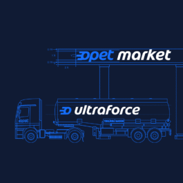
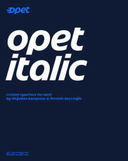
Opet Italic
Custom typeface for Opet.
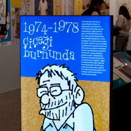
Latif Demirci
Custom font based on lettering by comic artist Latif Demirci. Designed and used for his retrospective exhibition at İş Sanat İstanbul. Art Direction: Emre Senan
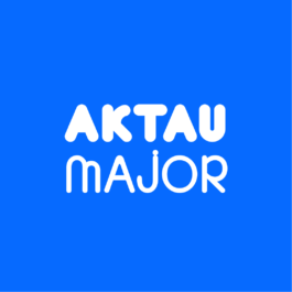
Aktau Major
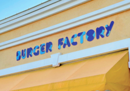
A playful display with 5 weights, supporting Latin and Cyrillic.
Lead Designer: Emre Senan
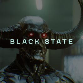
Black State
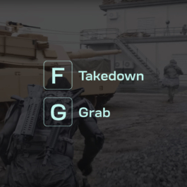
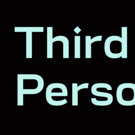
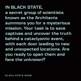
Custom typeface for AAA video-game Black State.
Pomus Variable Logotype
Logotype design and variable font development for a film production company.
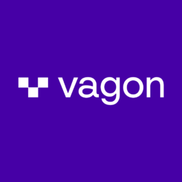
Vagon
Custom logotype and brand mark for Vagon Cloud Computers.
Custom typography services
Alongside our retail typefaces, we collaborate with brands and agencies to craft personalized typefaces and logotypes that capture the essence of their brands. Our goal is to deliver innovative typographic solutions, helping your brand to establish a distinctive presence among your peers. Whether you need support from the start or expertise to bring your vision to life, we are here to work with you. Let's connect and together, we'll elevate your typographic expression to new heights.
Why do you need custom typography?
Boost Your Brand Awareness
Get a custom typeface tailored for your brand! Enhance your brand identity and increase recognition; stand out from your competitors.
License without restrictions
Get your custom typeface and own it! No recurring payments, legal issues or expansions when your company gets bigger. Unlimited usage for unlimited number of users.
Unlock Unique Features Beyond Standard Retail Fonts
Have more properties and features than a from-the-shelf retail typeface. Expanding to a new market or country? We’ve got you covered! You can even have your logo as a font file for greater compatibility.
Make Your Brand Multilingual
Enhance your brand’s global reach by extending your custom typeface to support multiple languages; communicate effectively across diverse markets.
Opet Italic
Custom typeface for Opet.
Latif Demirci
Custom font based on lettering by comic artist Latif Demirci. Designed and used for his retrospective exhibition at İş Sanat İstanbul. Art Direction: Emre Senan
Aktau Major
A playful display with 5 weights, supporting Latin and Cyrillic.
Lead Designer: Emre Senan
Black State
Custom typeface for AAA video-game Black State.
Pomus Variable Logotype
Logotype design and variable font development for a film production company.
Vagon
Custom logotype and brand mark for Vagon Cloud Computers.
2026 © Element Type Foundry
2026 © Element Type Foundry
Opet Italic
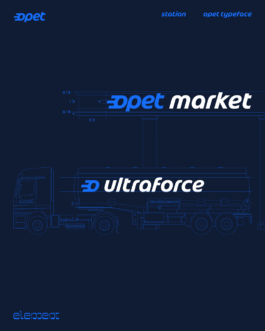
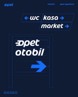
In 2025, we worked closely with Opet to redraw their custom typeface, which is based on their iconic logotype designed by Ivan Chermayeff in 2004.
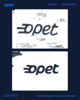
Opet, one of the biggest fuel companies in Turkey, commissioned Ivan Chermayeff in 2000 to create a new branding. As a part of the branding, a custom typeface was developed out of Opet's new logotype. Chermayeff's team turned the hand-drawn logotype into vector drawings and extended the character set in Adobe Illustrator, then handed digital drawings to Agfa Monotype in order to turn them into font files.
Opet's team shared the original drawings and the design assets with us. Instead of relying on the shapes of the existing font, which fail to meet many current technical standards and are essentially an interpretation of Chermayeff’s original designs, we began examining the original drawings. We’ve started to map out a plan for everything we want to improve—from curve quality and proportions to inconsistencies amongst shapes and the italic angle.
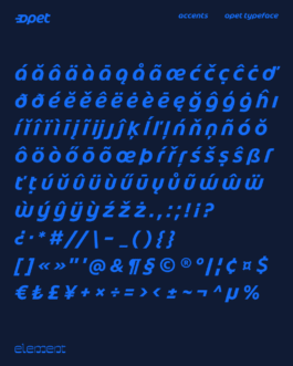
We expanded the character set for wider language support, engineered the font files, and added a couple of new design features.
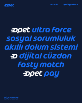
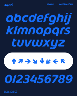
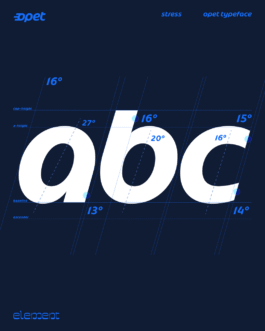
We slightly reduced the x-height to achieve wider proportions. That allowed us to reduce the curve tension on round shapes, as they were rather pointy/egg-shaped on the drawings. Reducing the x-height also gave a bit more presence to the ascenders and descenders.
As we followed the humanistic touch of the original design, we couldn’t help but make the terminals of glyphs such as s, 2, f more prominent.
Improvements on the general inconsistencies, italic angles, and the curve quality meant a fresh look that harmonises the calligraphic roots with digital drawing.
In Opet’s daily use, figures carry a great deal of information, so their proportions and spacing require close attention. We aligned them with the ascenders so they naturally flow within text.
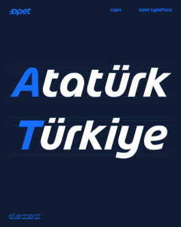
Although the font consists entirely of lowercase letters, the capital A and T were designed for certain commonly used proper nouns.
Since Opet operates across a wide and varied technical infrastructure, compatibility was central to the brief. The font files had to work not only in contemporary design environments, but also in older systems still used in the field. We made sure that every font file works seamlessly almost anywhere, from Figma on a MacBook to a kiosk running Windows XP.
From the initial sketches to the typography and engineering, we are thrilled to have taken up the original Opet Italic logo and to have contributed to this iconic design.
Opet Italic
In 2025, we worked closely with Opet to redraw their custom typeface, which is based on their iconic logotype designed by Ivan Chermayeff in 2004.
Opet, one of the biggest fuel companies in Turkey, commissioned Ivan Chermayeff in 2000 to create a new branding. As a part of the branding, a custom typeface was developed out of Opet's new logotype. Chermayeff's team turned the hand-drawn logotype into vector drawings and extended the character set in Adobe Illustrator, then handed digital drawings to Agfa Monotype in order to turn them into font files.
Opet's team shared the original drawings and the design assets with us. Instead of relying on the shapes of the existing font, which fail to meet many current technical standards and are essentially an interpretation of Chermayeff’s original designs, we began examining the original drawings. We’ve started to map out a plan for everything we want to improve—from curve quality and proportions to inconsistencies amongst shapes and the italic angle.
We expanded the character set for wider language support, engineered the font files, and added a couple of new design features.
We slightly reduced the x-height to achieve wider proportions. That allowed us to reduce the curve tension on round shapes, as they were rather pointy/egg-shaped on the drawings. Reducing the x-height also gave a bit more presence to the ascenders and descenders.
As we followed the humanistic touch of the original design, we couldn’t help but make the terminals of glyphs such as s, 2, f more prominent.
Improvements on the general inconsistencies, italic angles, and the curve quality meant a fresh look that harmonises the calligraphic roots with digital drawing.
In Opet’s daily use, figures carry a great deal of information, so their proportions and spacing require close attention. We aligned them with the ascenders so they naturally flow within text.
Although the font consists entirely of lowercase letters, the capital A and T were designed for certain commonly used proper nouns.
Since Opet operates across a wide and varied technical infrastructure, compatibility was central to the brief. The font files had to work not only in contemporary design environments, but also in older systems still used in the field. We made sure that every font file works seamlessly almost anywhere, from Figma on a MacBook to a kiosk running Windows XP.
From the initial sketches to the typography and engineering, we are thrilled to have taken up the original Opet Italic logo and to have contributed to this iconic design.
Latif Demirci
Custom font based on lettering by comic artist Latif Demirci. Designed and used for his retrospective exhibition at İş Sanat İstanbul. Art Direction: Emre Senan
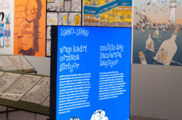
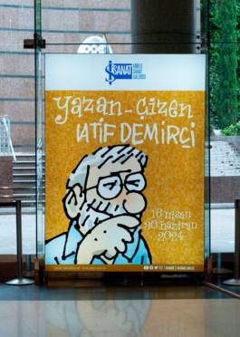
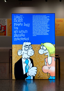
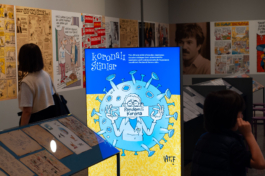
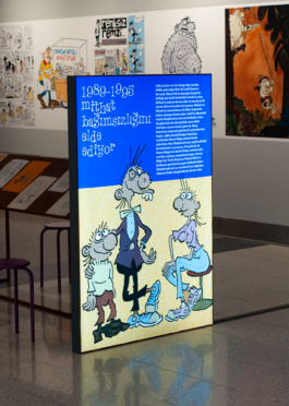
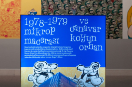
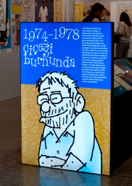
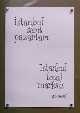
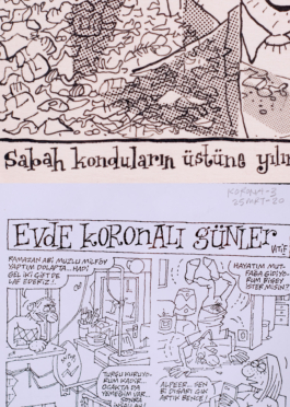
Examples of lettering from artist's work.
Latif Demirci
Custom font based on lettering by comic artist Latif Demirci. Designed and used for his retrospective exhibition at İş Sanat İstanbul. Art Direction: Emre Senan
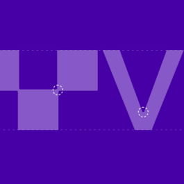
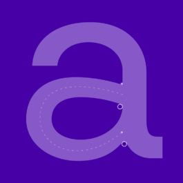
Vagon
Custom logotype and brand mark for Vagon Cloud Computers.

Vagon
Custom logotype and brand mark for Vagon Cloud Computers.
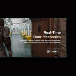
Black State
Custom typeface for AAA video-game Black State.
Black State
Custom typeface for AAA video-game Black State.
Aktau Major
A playful display with 5 weights, supporting Latin and Cyrillic.
Lead Designer: Emre Senan
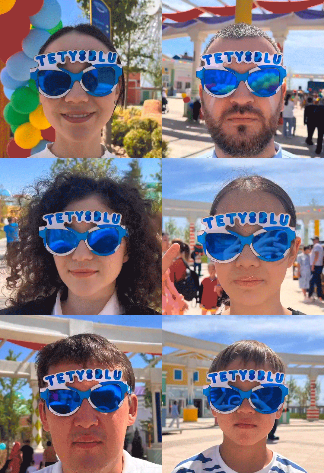
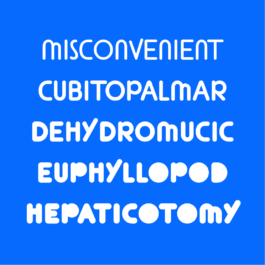
Aktau Major
A playful display with 5 weights, supporting Latin and Cyrillic.
Lead Designer: Emre Senan